
Rebrand / Visual Identity / Naming / Branding
Brasil, 2008
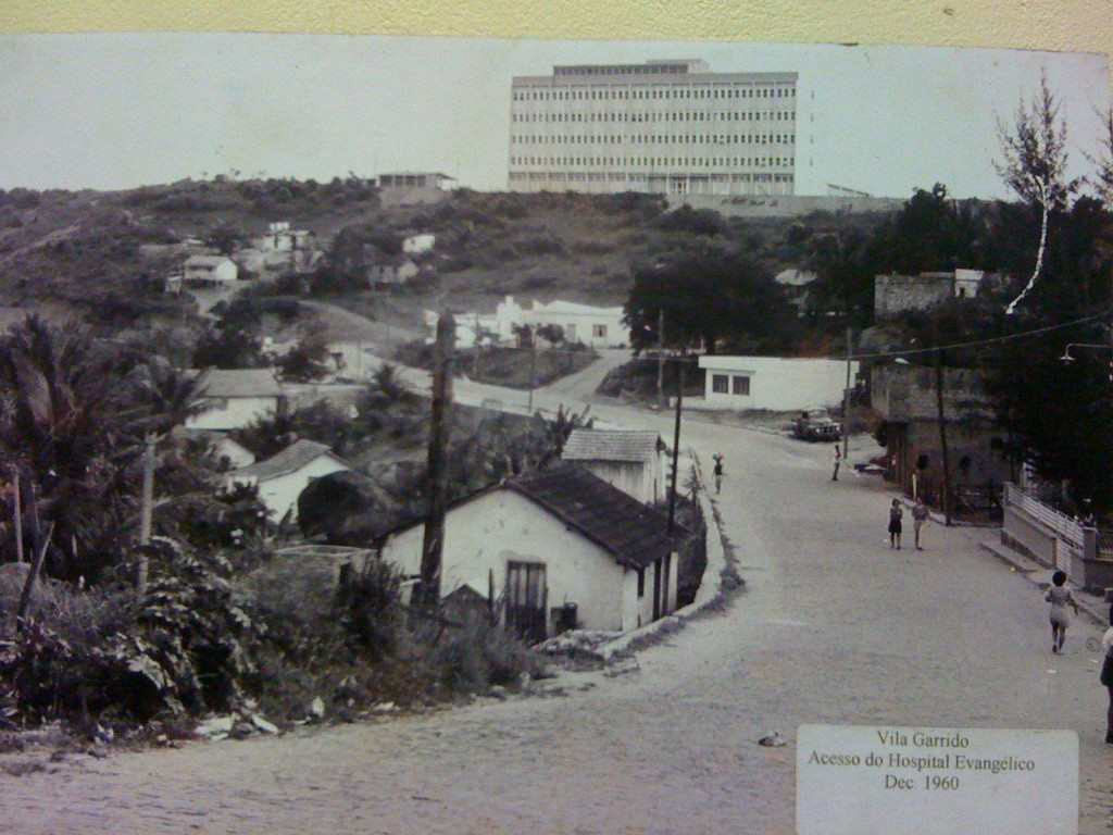
Hospital Evangélico de Vila Velha - ES
About
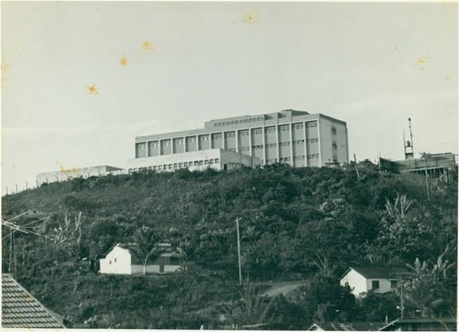
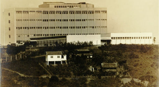
Founded in 1972, a history of the Evangelical Hospital of Vila Velha begins years earlier, in 1956, when it began to be idealized by the Baptist, Christian Evangelical House of Prayer, Evangelical Lutheran Confession, Methodist, Brazilian Presbyterian and United Presbyterian churches, which compose Aebes - Associação Evangélica Beneficente Espírito Santense. The unit has a multidisciplinary team and a reference in urgency and cardiovascular emergency and qualified in medium and high complexity in the specialties: Cardiovascular, Neurosurgery, Bariatric, Ophthalmology, Oncology and Edge, Heart, Heart and Tissue Transplants. The Evangelical Hospital of Vila Velha is the only philanthropic hospital in Espírito Santo that obtained the highest classification in hospital management: ONA level 3 excellence certification, in addition to ISO 9001: 2015.
Founded in 1972, a history of the Evangelical Hospital of Vila Velha begins years earlier, in 1956, when it began to be idealized by the Baptist, Christian Evangelical House of Prayer, Evangelical Lutheran Confession, Methodist, Brazilian Presbyterian and United Presbyterian churches, which compose Aebes - Associação Evangélica Beneficente Espírito Santense. The unit has a multidisciplinary team and a reference in urgency and cardiovascular emergency and qualified in medium and high complexity in the specialties: Cardiovascular, Neurosurgery, Bariatric, Ophthalmology, Oncology and Edge, Heart, Heart and Tissue Transplants. The Evangelical Hospital of Vila Velha is the only philanthropic hospital in Espírito Santo that obtained the highest classification in hospital management: ONA level 3 excellence certification, in addition to ISO 9001: 2015.
Challenge
After 38 years of activity, being a national cardiovascular reference and in various specialties, the Evangelical Hospital of Vila Velha needed to revitalize its visual, verbal identity, communication with the population and all its contact points and partners. Thus, they developed the Contest for the Creation of the New Brand of the Evangelical Hospital, promoted by the agency Asas Comunicação, which should transmit all the work and humanized look and the highest evangelical Christian principles maintained by the hospital over the years, which I won with the project presented.
After 38 years of activity, being a national cardiovascular reference and in various specialties, the Evangelical Hospital of Vila Velha needed to revitalize its visual, verbal identity, communication with the population and all its contact points and partners. Thus, they developed the Contest for the Creation of the New Brand of the Evangelical Hospital, promoted by the agency Asas Comunicação, which should transmit all the work and humanized look and the highest evangelical Christian principles maintained by the hospital over the years, which I won with the project presented.

Creation
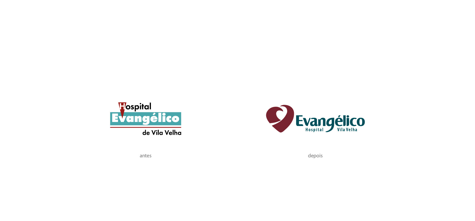
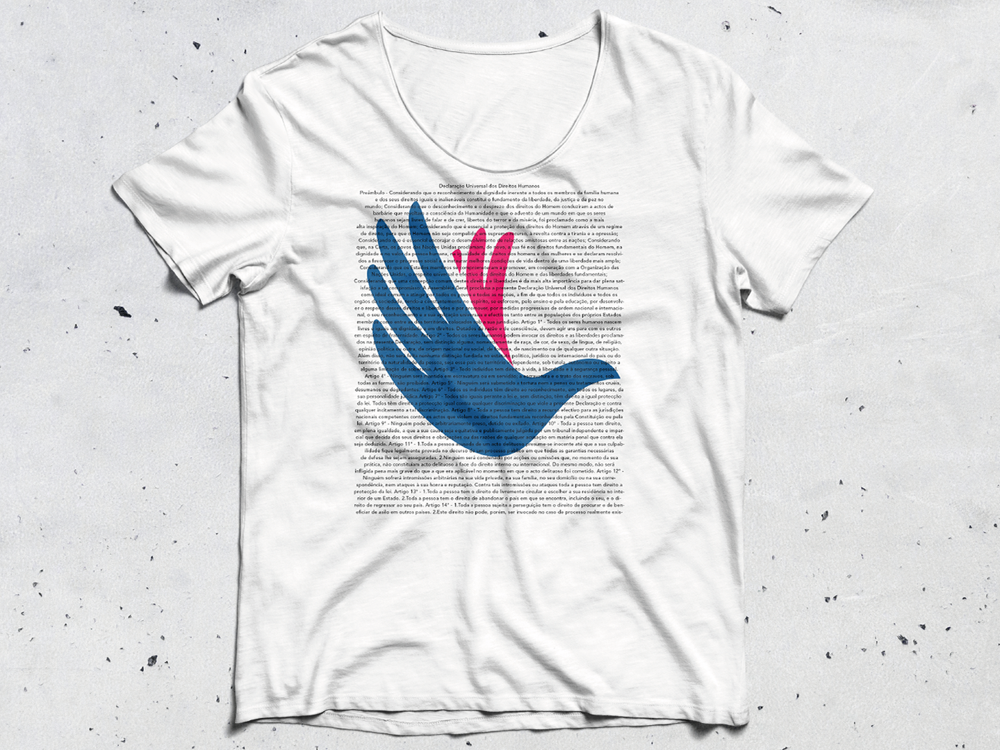
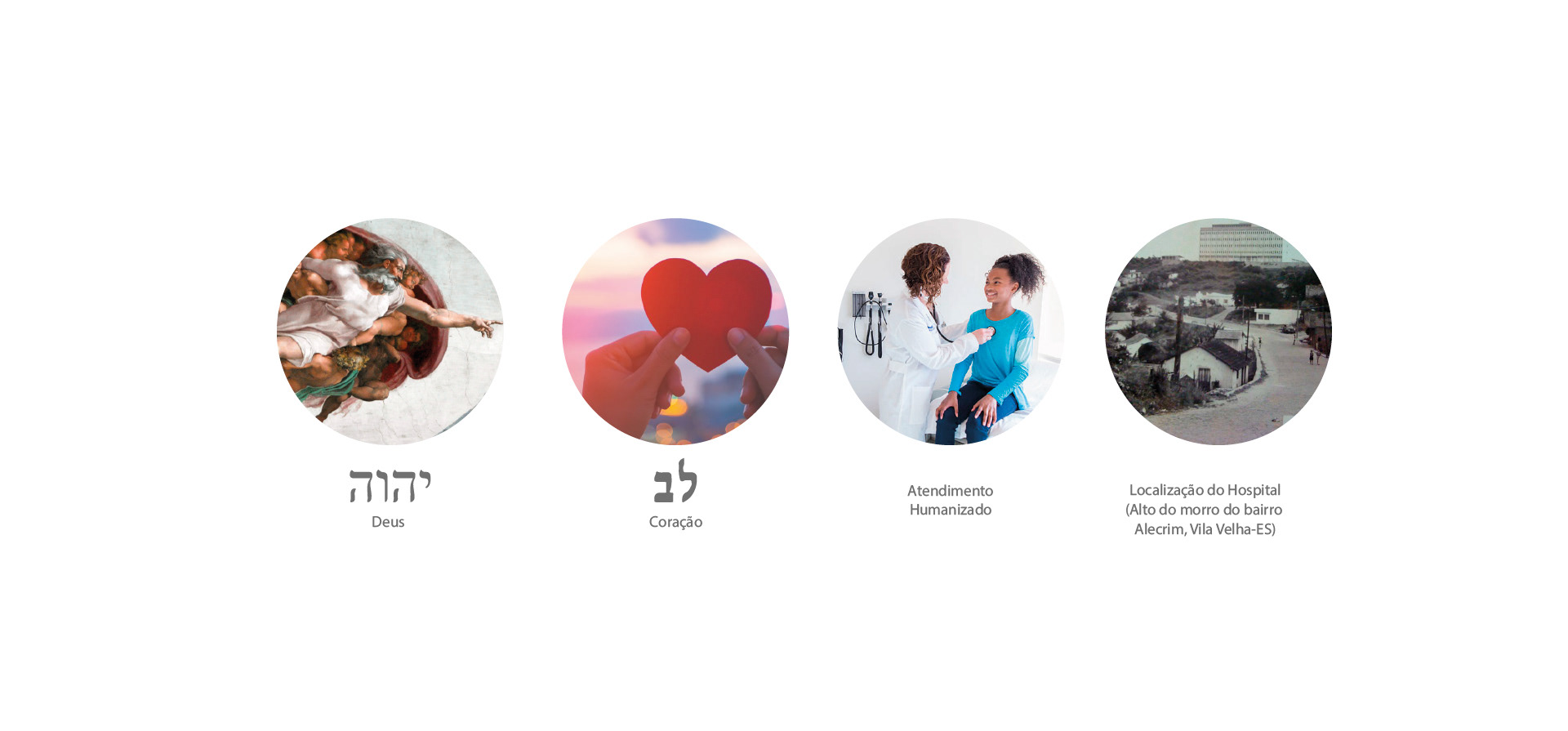
The symbol was created under the eye of the heart throughout the Old Testament (lev in Hebrew) is considered a place of mind and intellectuality, where all the teachings of God (YHVH - vuvh in Hebrew), as the "Love of God" determined by the first four commandments and the "Love of neighbor" by the last five described in Exodus 20. A place of feelings, where all joy or suffering is expressed and presented before God.
The symbol was created under the eye of the heart throughout the Old Testament (lev in Hebrew) is considered a place of mind and intellectuality, where all the teachings of God (YHVH - vuvh in Hebrew), as the "Love of God" determined by the first four commandments and the "Love of neighbor" by the last five described in Exodus 20. A place of feelings, where all joy or suffering is expressed and presented before God.
The symbolic heart of the Evangelical Hospital of Vila Velha has two parts that represent educational support and the health sector, a mission that is transmitted to the entire academic, medical and civil community through its specialized services and commitment to life.
Between these two parts, a path is formed, which presents the right direction from which to find “love for one's neighbor”, through the humanization of the hospital and the comfort and assistance to the client presented “the way, the truth and the life” ( John 14: 6).

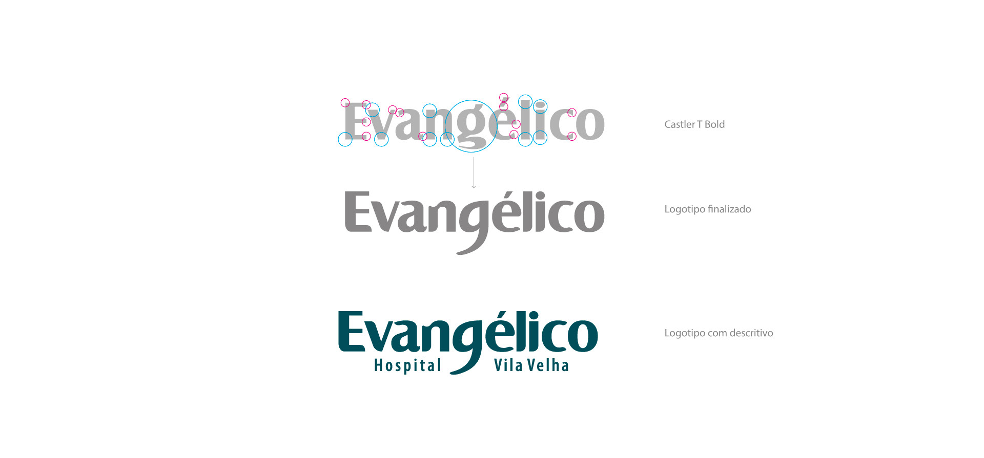
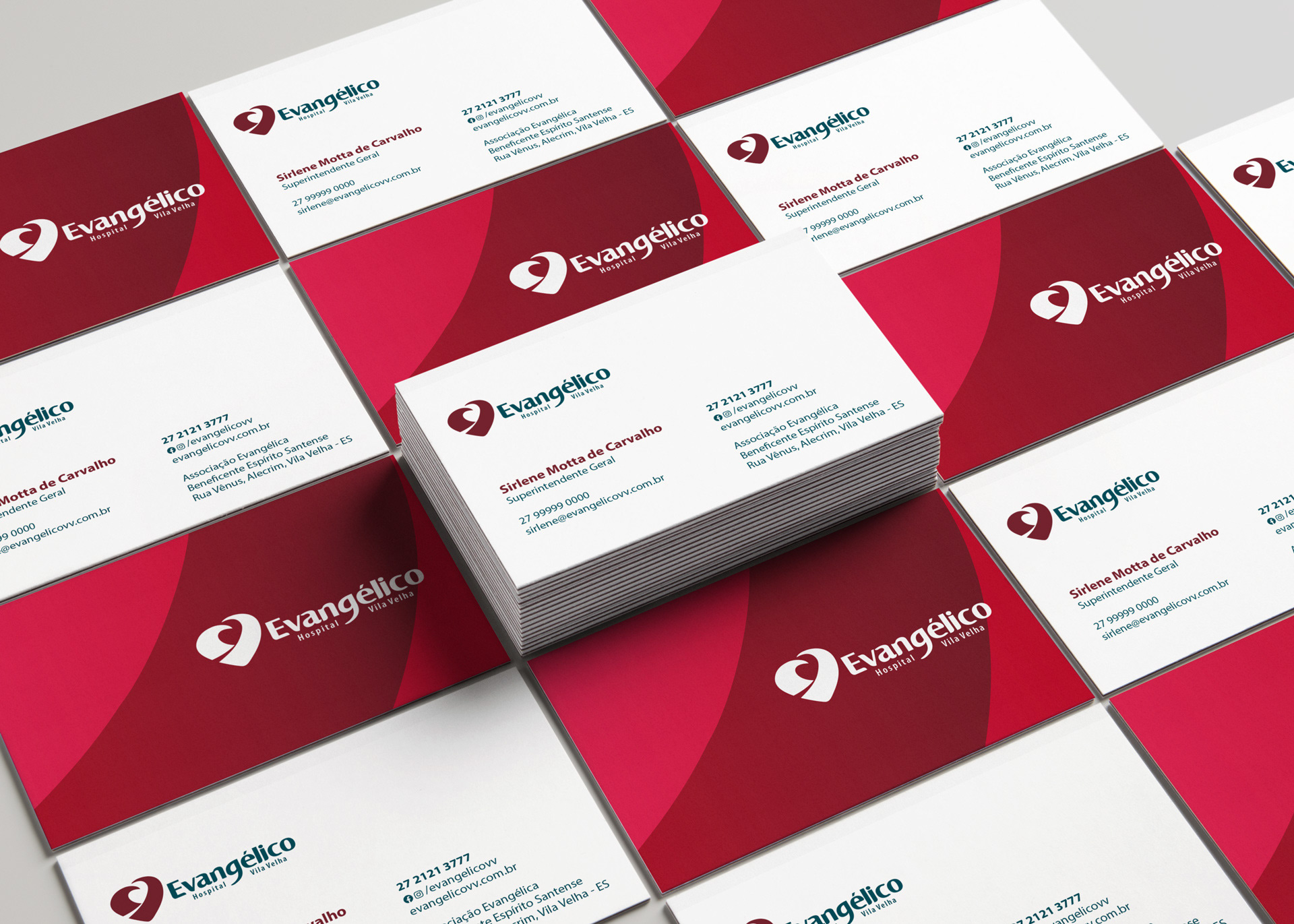
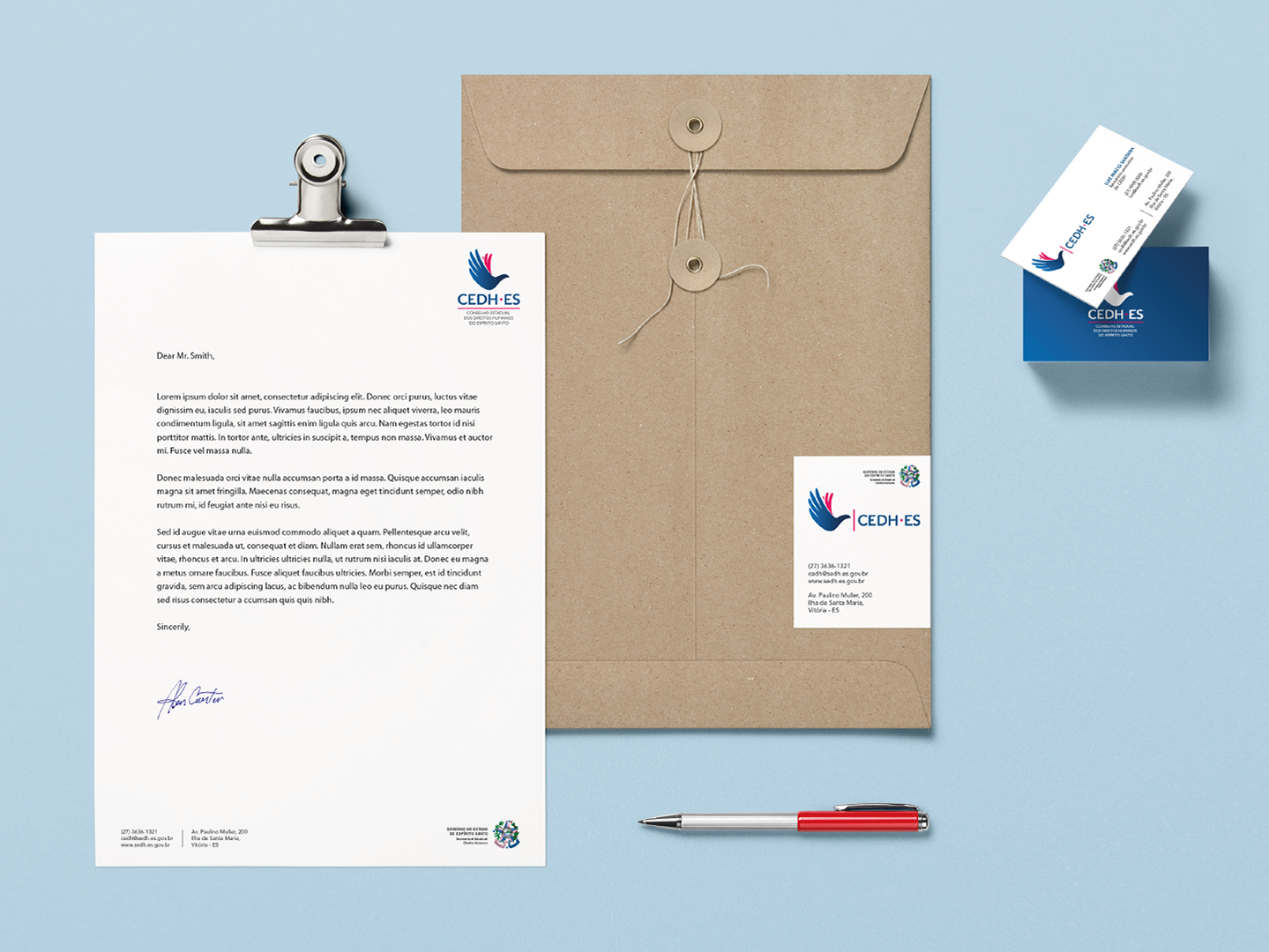
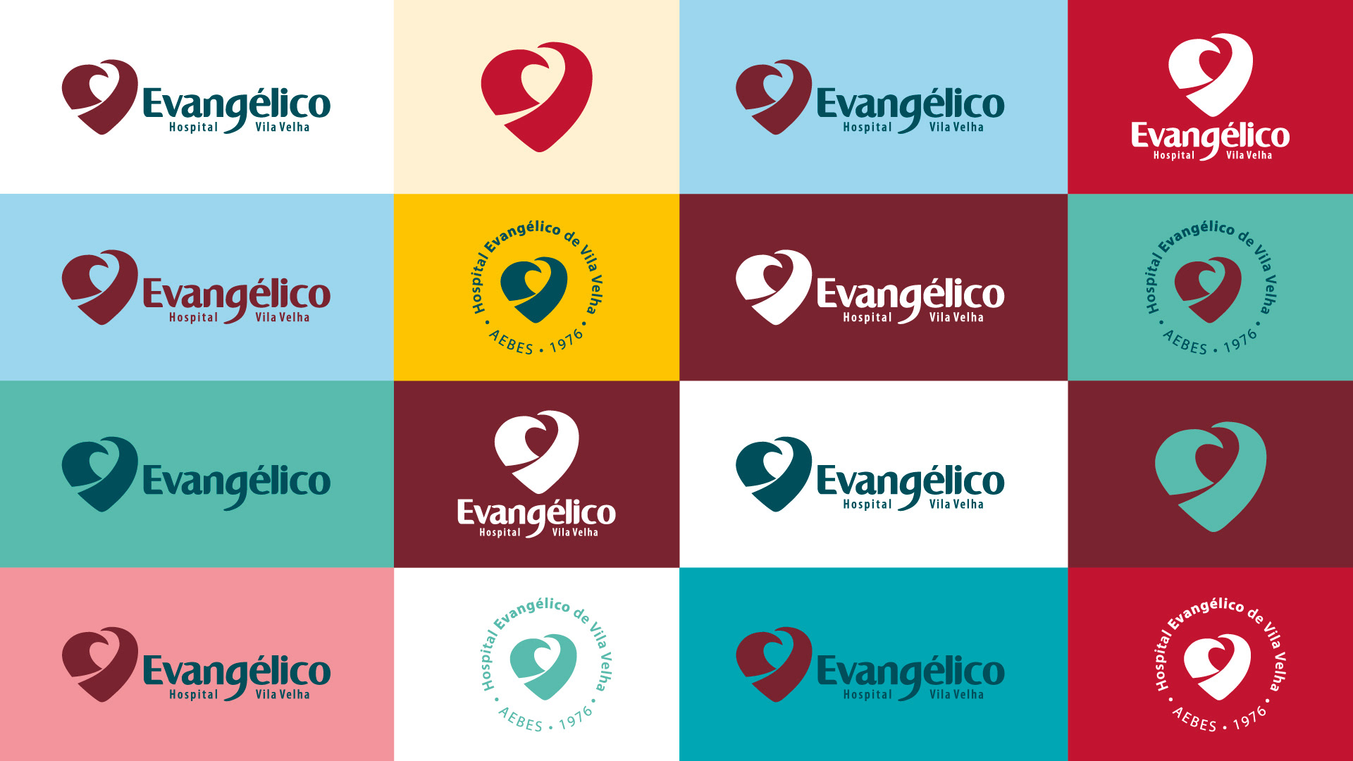
Logotype
The logo was developed from the contemporary font Castle T Bold, which has a good reading, also giving strength and weight to the name. Several interventions were made in this to incorporate its own and humanized identity, being studied from its space to the exclusive creation of type G for the name Evangélico.
For the description, the font Myriad Pro Condensada was chosen because it is a clean and legible typography derived from the Sans Serif, transmitting stability and commitment of the hospital.

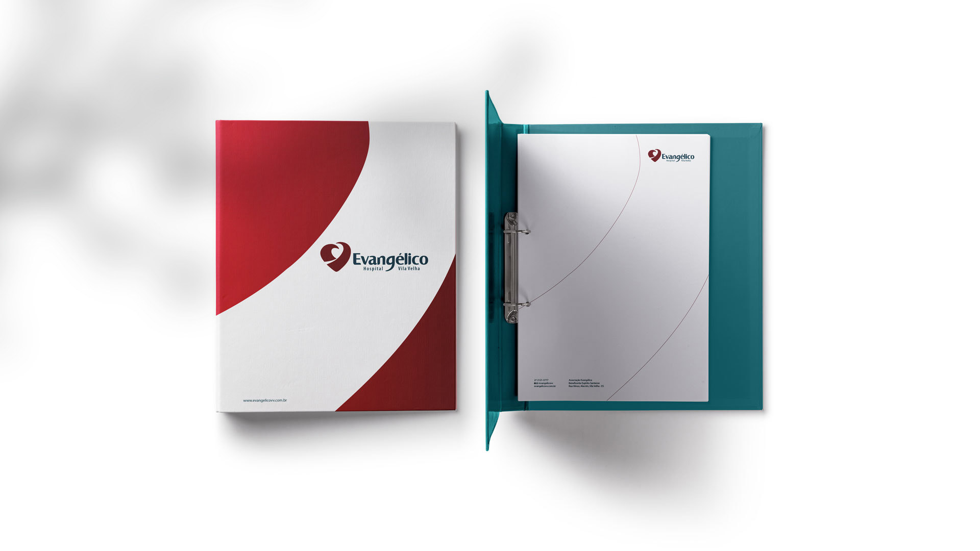
Colors
Burgundy red was chosen because it is a symbol of strength, and the sacrifice often made by hospital professionals and collaborators to educate and save, materially and spiritually, with the support of bluish green that provides tranquility, but with seriousness and respect.
Burgundy red was chosen because it is a symbol of strength, and the sacrifice often made by hospital professionals and collaborators to educate and save, materially and spiritually, with the support of bluish green that provides tranquility, but with seriousness and respect.
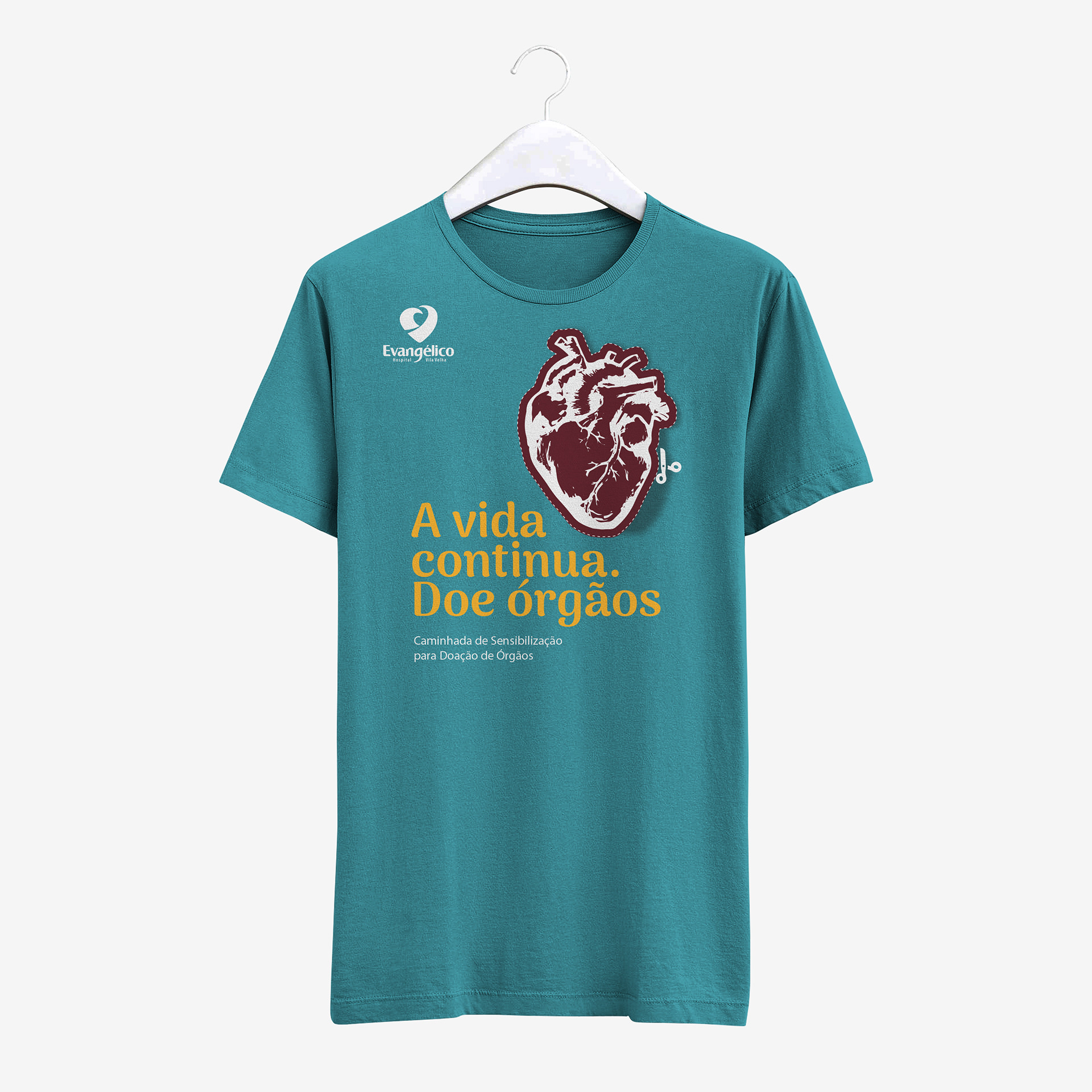
To support communication and other areas, we have developed another 2 complementary color palettes, thus expanding the range for other projects.